


Bringing EF Language to life
Company

EF Language Abroad
Project duration
Mar 2023- Aug 2024
Role
Experience Design Director
Focus areaHow we helped make the language offering easier to understand for kids and their parents
SituationEF’s youth language travel pages offered three product types for different age ranges. Our research showed that families struggled to understand the difference.
This problem space was tackled within the bigger language suite redesign encompassing 50+ destination pages, 7 product home pages and over 10 additional sites.

EF product sites launch for 7 products in 60 markets
+10%
lead conversion
+100% time on page
-40% bounce rate
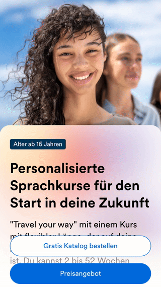
Homepage from 2021 for EF Language’s youth product with a toggle for all-inclusive and individual travel.
TaskMake it easier for guardians and their kids to understand EF’s course options at a glance – and help them feel confident choosing the right experience.
One step towards a more simplified product offering.
ActionUX research across Europe revealed key issues with naming, layout, and interaction.
We responded by:
• Removing the confusing toggle (gif above)
• Structuring options by age group instead of abstract labels
• Improving visual hierarchy for faster scanning
• Collaborating with product to simplify naming and framing

“Anna consistently brought valuable insights to every project, making collaboration not only productive but genuinely exciting. She has a rare ability to connect with people, foster cross-functional alignment, and break down silos with empathy and emotional intelligence.”
Jose - Senior Global Digital Marketing Leader, EF Language
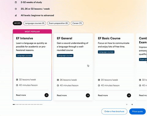
Course overview with filtering options.
Result• Clearer understanding of course types for both parents and kids
• Easier comparisons between travel styles
• Increased engagement with course info and lead forms
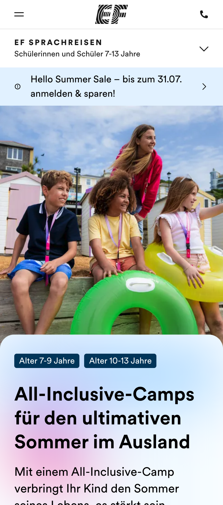
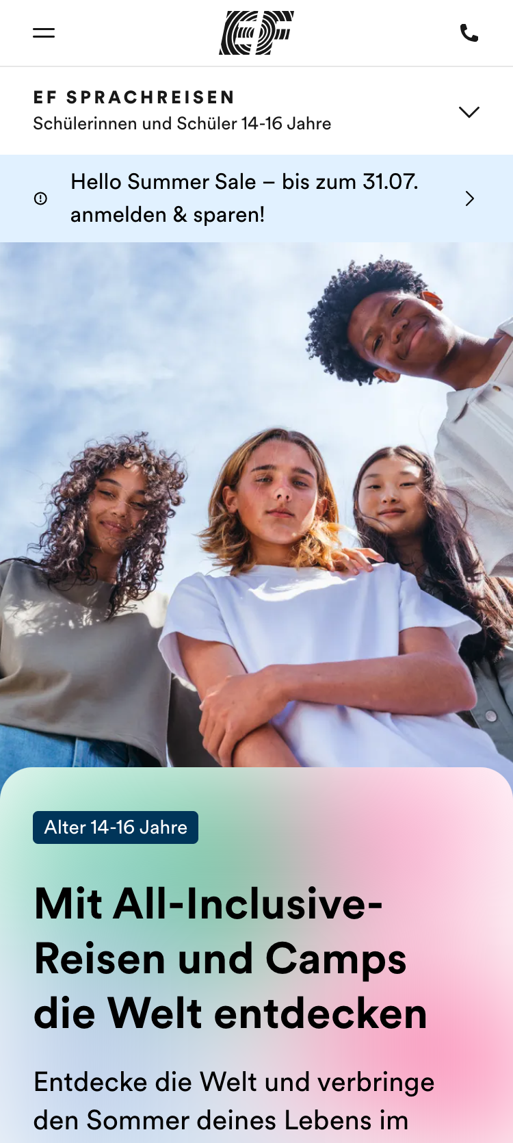
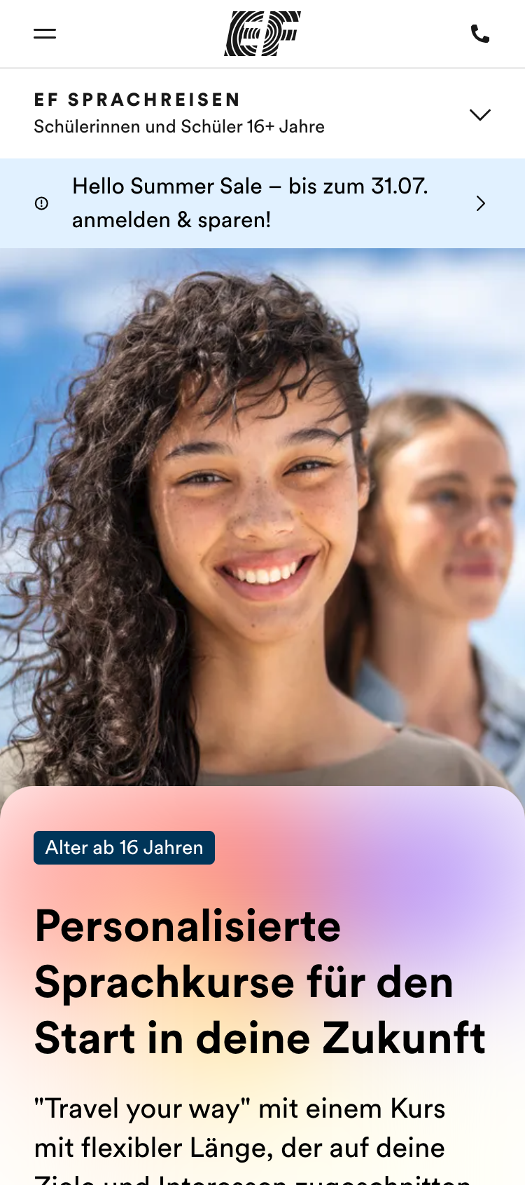
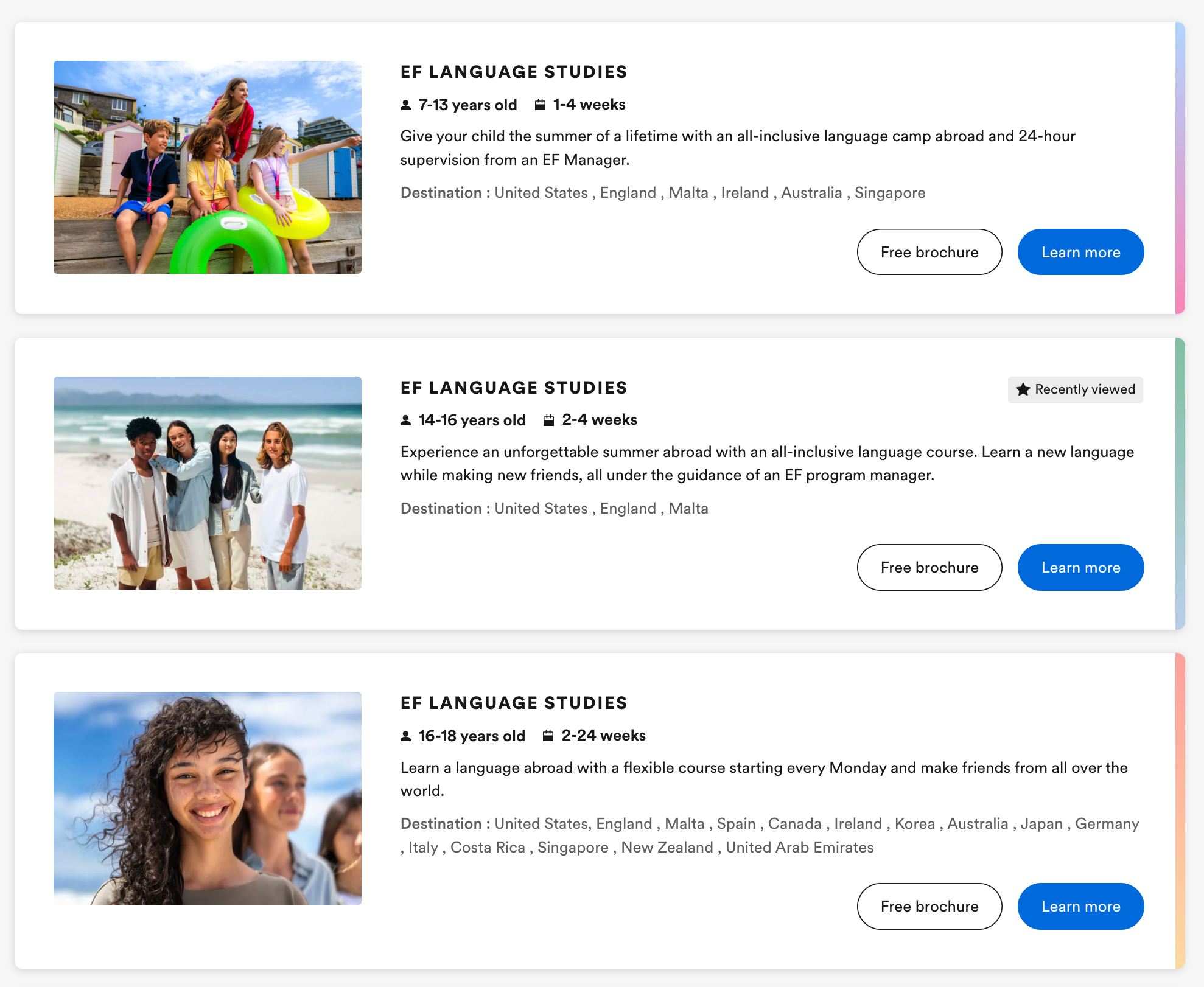
Snippets from the sites for EF Language’s youth offering.
Key takeaways
The experience design team didn’t just fix the interface – it reshaped the offer to better match how families choose.
Using storytelling in presentations helps to bring across the main pain points and advocate for system change.
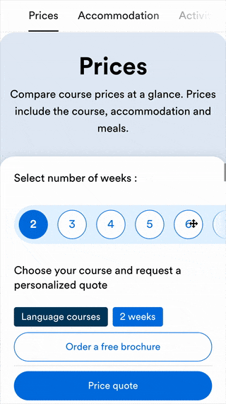
For the price table we experimented a lot around the week selector and connecting the information in the price table well.
Behind the scenes
For the overarching project, I established a customer-centric workflow, grounding design decisions in both qualitative and quantitative insights.
I led and facilitated workshops and regular stakeholder check-ins alongside project managers and the core team.
For key elements like homepage heroes, I created prototypes and collaborated closely with individual designers to turn concepts into scalable components.
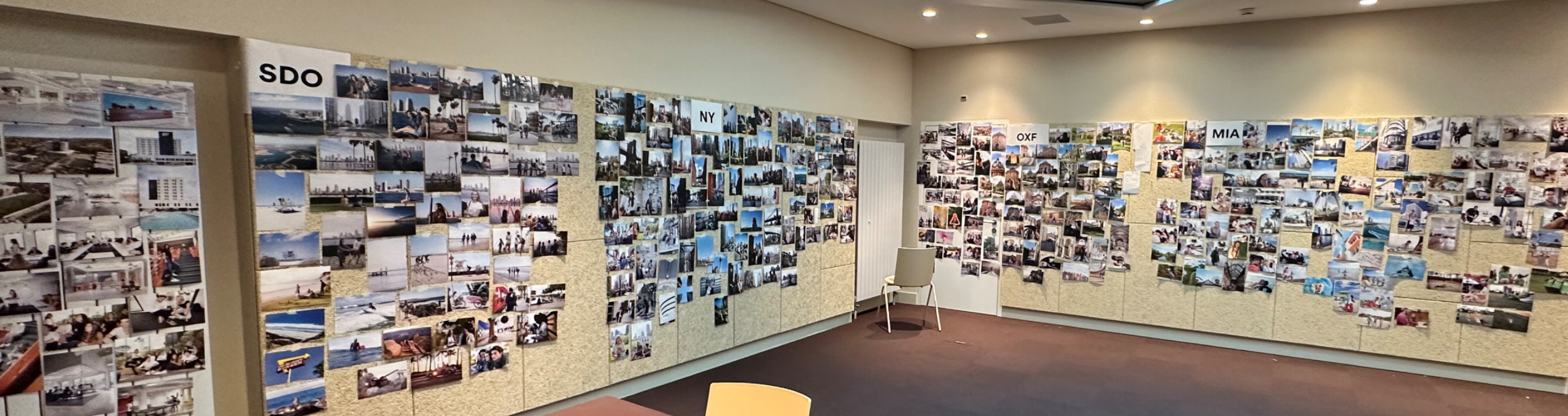
Image selection with 4 art directors, Creative directors, and senior stakeholders ↑

Destination page from 2021, where we conducted usability tests to understand the problems (on mobile all sections were collapsed) ↑
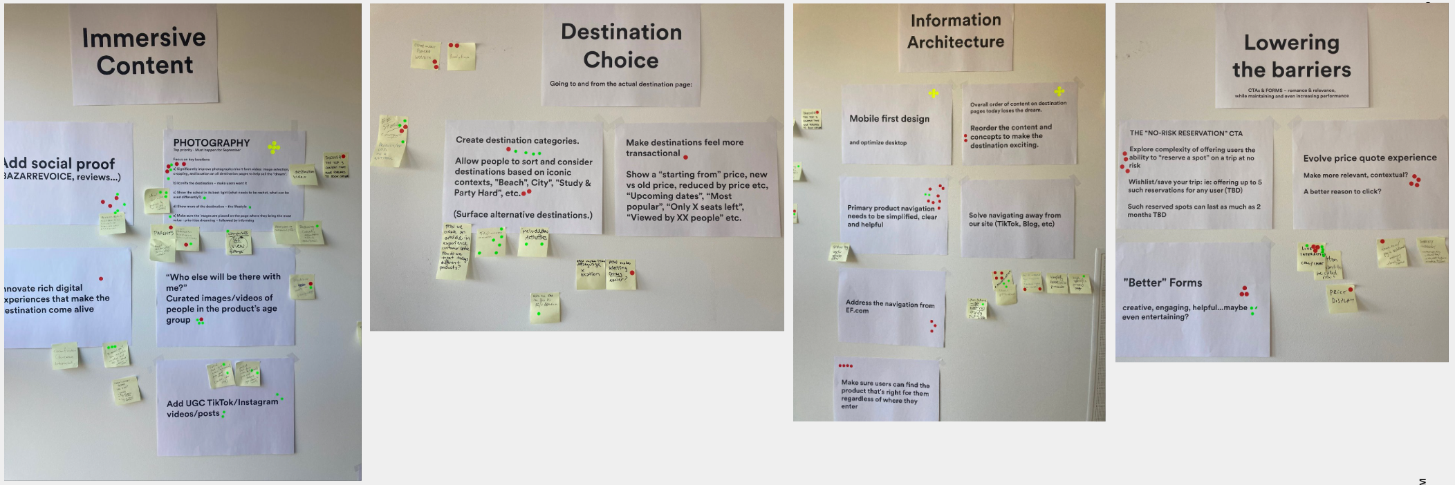
Senior stakeholder workshop for prioritisation ↑

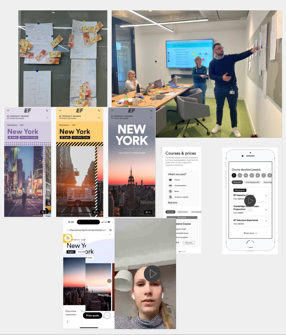

Design ideation and iterations with mixed method testing ↑
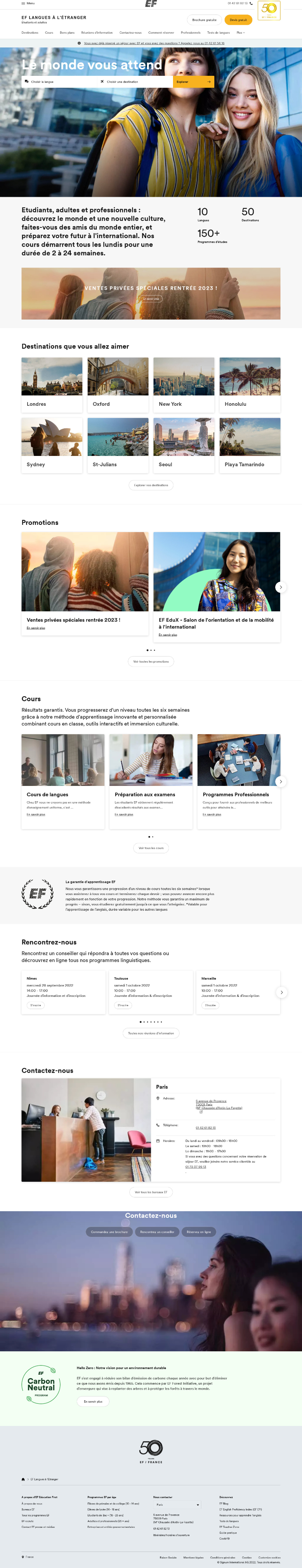
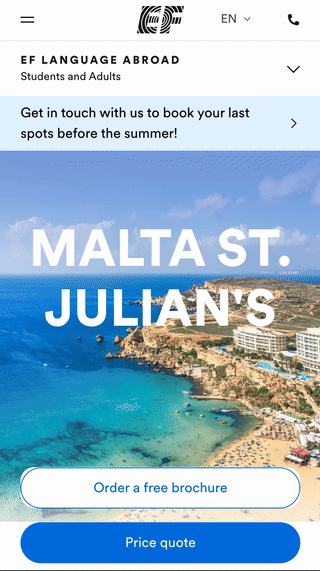
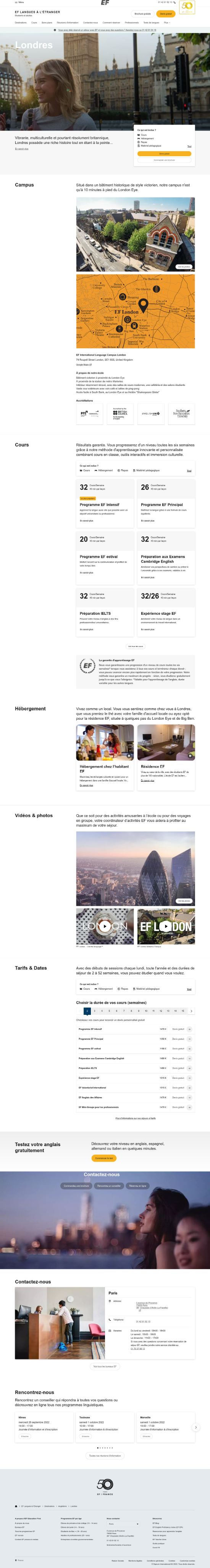
Home page from 2021 for the product “EF Languages Abroad – Students and Adults” ↑

Bringing EF Language to life
Company

EF Language Abroad
Project duration
Mar 2023- Aug 2024
Role
Experience Design Director
Focus areaHow we helped make the language offering easier to understand for kids and their parents
SituationEF’s youth language travel pages offered three product types for different age ranges. Our research showed that families struggled to understand the difference.
This problem space was tackled within the bigger language suite redesign encompassing 50+ destination pages, 7 product home pages and over 10 additional sites.
EF product sites launch for 7 products in 60 markets
+10%
lead conversion
+100% time on page
-40% bounce rate
Homepage from 2021 for EF Language’s youth product with a toggle for all-inclusive and individual travel.
TaskMake it easier for guardians and their kids to understand EF’s course options at a glance – and help them feel confident choosing the right experience.
One step towards a more simplified product offering.
ActionUX research across Europe revealed key issues with naming, layout, and interaction.
We responded by:
• Removing the confusing toggle (gif above)
• Structuring options by age group instead of abstract labels
• Improving visual hierarchy for faster scanning
• Collaborating with product to simplify naming and framing
“Anna consistently brought valuable insights to every project, making collaboration not only productive but genuinely exciting. She has a rare ability to connect with people, foster cross-functional alignment, and break down silos with empathy and emotional intelligence.”
Jose - Senior Global Digital Marketing Leader, EF Language
Course overview with filtering options.
Result• Clearer understanding of course types for both parents and kids
• Easier comparisons between travel styles
• Increased engagement with course info and lead forms
Snippets from the sites for EF Language’s youth offering.
Key takeaways
The experience design team didn’t just fix the interface – it reshaped the offer to better match how families choose.
Using storytelling in presentations helps to bring across the main pain points and advocate for system change.
For the price table we experimented a lot around the week selector and connecting the information in the price table well.
Behind the scenes
For the overarching project, I established a customer-centric workflow, grounding design decisions in both qualitative and quantitative insights.
I led and facilitated workshops and regular stakeholder check-ins alongside project managers and the core team.
For key elements like homepage heroes, I created prototypes and collaborated closely with individual designers to turn concepts into scalable components.
Image selection with 4 art directors, Creative directors, and senior stakeholders ↑

Destination page from 2021, where we conducted usability tests to understand the problems (on mobile all sections were collapsed) ↑

Senior stakeholder workshop for prioritisation ↑
Design ideation and iterations with mixed method testing ↑
Home page from 2021 for the product “EF Languages Abroad – Students and Adults” ↑
Bringing EF Language to life
Company
EF Language Abroad
Project duration
Mar 2023- Aug 2024
Role
Experience Design Director
Focus areaHow we helped make the language offering easier to understand for kids and their parents
SituationEF’s youth language travel pages offered three product types for different age ranges. Our research showed that families struggled to understand the difference.
This problem space was tackled within the bigger language suite redesign encompassing 50+ destination pages, 7 product home pages and over 10 additional sites.

EF product sites launch for 7 products in 60 markets
+10%
lead conversion
+100% time on page
-40% bounce rate
Homepage from 2021 for EF Language’s youth product with a toggle for all-inclusive and individual travel.
TaskMake it easier for guardians and their kids to understand EF’s course options at a glance – and help them feel confident choosing the right experience.
ActionUX research across Europe revealed key issues with naming, layout, and interaction.
We responded by:
• Removing the confusing toggle (gif above)
• Structuring options by age group instead of abstract labels
• Improving visual hierarchy for faster scanning
• Collaborating with product to simplify naming and framing
One step towards a more simplified product offering.

“Anna consistently brought valuable insights to every project, making collaboration not only productive but genuinely exciting. She has a rare ability to connect with people, foster cross-functional alignment, and break down silos with empathy and emotional intelligence.”
Jose - Senior Global Digital Marketing Leader, EF Language
Course overview with filtering options.
Result• Clearer understanding of course types for both parents and kids
• Easier comparisons between travel styles
• Increased engagement with course info and lead forms
Snippets from the sites for EF Language’s youth offering.
Key takeaways
The experience design team didn’t just fix the interface – it reshaped the offer to better match how families choose.
Using storytelling in presentations helps to bring across the main pain points and advocate for system change.
For the price table we experimented a lot around the week selector and connecting the information in the price table well.
Behind the scenes
For the overarching project, I established a customer-centric workflow, grounding design decisions in both qualitative and quantitative insights.
I led and facilitated workshops and regular stakeholder check-ins alongside project managers and the core team.
For key elements like homepage heroes, I created prototypes and collaborated closely with individual designers to turn concepts into scalable components.
Image selection with 4 art directors, Creative directors, and senior stakeholders ↑

Destination page from 2021, where we conducted usability tests to understand the problems (on mobile all sections were collapsed) ↑

Senior stakeholder workshop for prioritisation ↑


Design ideation and iterations with mixed method testing ↑
Home page from 2021 for the product “EF Languages Abroad – Students and Adults” ↑